
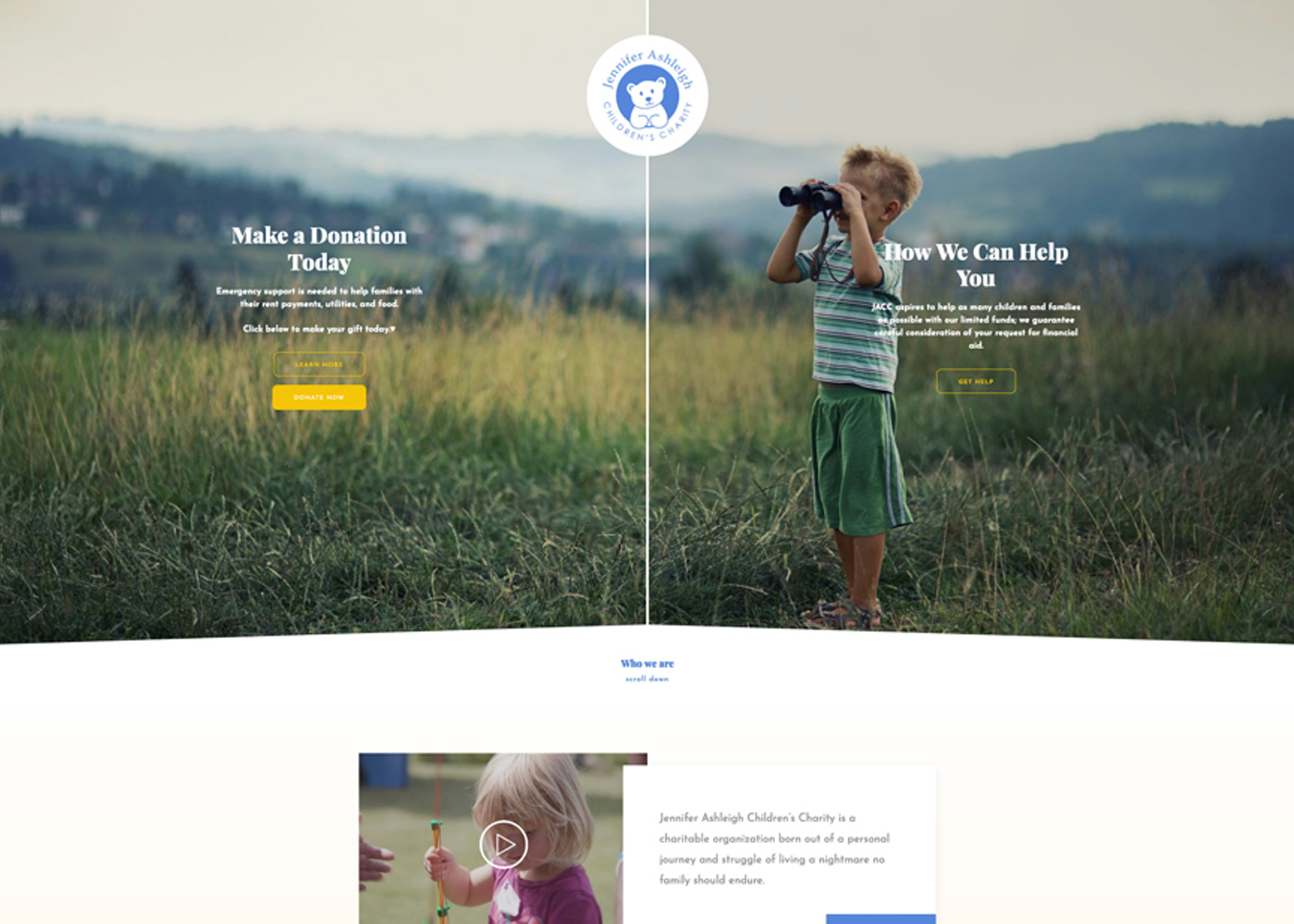
Jennifer Ashleigh Children's Charity Logo Redesign
-
Client
Jennifer Ashleigh Children's Charity
-
Category
Branding
-
Project Timeline
1 Months
-
Tools
Illustrator
Background
Jennifer Ashleigh Children’s Charity has been a beacon of hope for seriously and chronically ill children and their families across Ontario. Their mission, "To improve the quality of life for seriously and chronically ill children and their families when love is not enough," underscores their commitment to providing support beyond the medical realm. The charity works collaboratively with children’s hospitals, addressing financial gaps for families facing medical challenges.
Challenge:
The challenge presented to me was to modernize the brand's visual identity through an updated logo while respecting the sentimental value and originality of the existing branding. The goal was to create a visual representation that aligns with the charity's compassionate mission, appeals to a modern audience, and retains a connection to its established identity.
Solution:
My approach to the logo redesign for Jennifer Ashleigh Children’s Charity was rooted in a deep understanding of the organization's values, mission, and the emotional impact it has on the lives of the families it serves.
The goal was to encapsulate the essence of the charity in a modern, minimalistic design that could easily adapt to various mediums while preserving the authenticity of the original branding.

Outcome:
The result of the logo redesign was a contemporary yet timeless visual identity for Jennifer Ashleigh Children’s Charity.
The minimalistic approach not only modernized the brand but also ensured that the logo could adapt seamlessly to various applications without losing its emotional impact.
The refined color palette and updated typography contribute to a more cohesive and versatile brand presence.
The logo now stands as a symbol of hope and support for seriously and chronically ill children and their families, resonating with both existing supporters and a broader, modern audience.
The successful logo redesign demonstrates the delicate balance between preserving the authenticity of an established brand and adapting to the evolving visual landscape.
Jennifer Ashleigh Children’s Charity now has a refreshed visual identity that reflects its mission, values, and commitment to making a meaningful difference in the lives of those in need.